Your Brand Identity System Should Work Without Its Designers
A brand identity system should let non-designers build on-brand assets. The four layers it needs, three field tests, and when a lighter setup is enough.


Why Most B2B Guidelines Fail the Production Test
A functional brand identity system operates as an operational production engine rather than static documentation, establishing unambiguous mathematical, spatial, and verbal rules that allow non-designers to build on-brand assets autonomously. Most corporate guidelines gather dust in shared folders because they function as passive archives of past work. When a marketing team hands a static 80-page PDF to a field sales team, a regional agency, or a content writer, brand drift begins immediately. Assets start looking mismatched, logos appear crowded against edges, and sales presentations turn into patchworks of stock art.
The failure comes down to the execution gap. Designers create beautiful finished artifacts, but they document only the outcomes rather than the generative logic behind them. Without explicit rules for layout math, hierarchy, and spatial relationships, non-designers must guess.
In business-to-business marketing, consistency directly protects mental availability, which is the likelihood of a buyer noticing, recognizing, and thinking of your brand in a buying situation. When your touchpoints look fragmented, you force potential buyers to re-learn your identity on every channel. Clear visual brand codes ensure that every deck, one-pager, and campaign asset instantly links back to the master entity within your broader B2B brand architecture.
Style Guides Versus Operational Systems
A traditional style guide is descriptive. It lists what the brand has used in the past: a primary logo, three hex codes, two font names, and a handful of inspirational mood boards.
An operational brand identity system is prescriptive. It provides logic that governs how to build new assets that do not exist yet. It defines clear boundaries:
- Exactly how to scale typography across different screen ratios.
- Clear visual hierarchies that dictate whether color, type, or imagery carries the main focal load.
- Specific rules for contrast ratios, margin scaling, and clear space.
Consider the Dow Brand Guidelines. Rather than offering vague suggestions, Dow defines exact clear-space metrics (half the height of the iconic DOW Diamond) and explicit rules for when to use the full-color logo versus the reverse or black versions. It provides unambiguous boundaries so external vendors can execute without subjective debates.
Brand Identity, Brand Image, and Long-Term Equity
To build a reliable system, we must clarify the structural differences between brand identity, brand image, and brand equity:
- Brand Identity: The internal set of signals, codes, assets, and rules that an organization creates and controls.
- Brand Image: The external perception and mental associations held in the minds of consumers and buyers.
- Brand Equity: The commercial value and pricing power generated by consumer perception and distinctiveness over time.
Identity is the only piece of this equation under your direct operational control. When identity is executed with discipline across all customer touchpoints, it shapes an accurate brand image, which steadily builds brand equity. Consistent codes feed that chain. As we cover in how B2B brand equity pays off, a strong brand lowers perceived risk and supports pricing power.
The Four Core Components of a Functional Brand Identity System
A complete brand identity system operates across four coordinated layers. If any single layer is missing, the system breaks down under real production demands. The systems that hold up are the ones where every layer answers one question: can someone who has never met the brand team produce an asset that looks like it belongs?
1. Distinctive Brand Assets and Visual Identifiers
Distinctive brand assets are sensory cues (colors, shapes, fonts, sonic marks, mascots) that trigger brand recognition without requiring the brand name. Knowing how to build distinctive brand assets begins with selecting a focused set of identifiers and enforcing them ruthlessly.
Using the distinctive asset grid, brands can map which assets are genuinely unique and widely recognized versus those that add clutter. The grid forces a decision: keep an asset because it carries recognition, or cut it because it creates noise.
The HP Brand Visual Identity demonstrates this discipline. HP organizes its visual presence around a single signature Electric Blue, a minimum clear space of 25% of the logo, and a stripe system that matches the 20-degree angle and grid of the logo's slanted letterforms. These assets anchor every layout so that even a cropped section of an ad is unmistakably HP.
HP succeeds by refusing to let any layout exist without at least one of these core identifiers carrying the focal load.
2. Prescriptive Layout Grids, Typography, and Motion Rules
A system must specify how elements relate in physical and digital space. Without that specification, every new asset becomes a negotiation between whoever is building it and whatever they think looks right at the time.
This layer includes:
- Typographic Scale: Strict hierarchies for headlines, subtitles, lead paragraphs, and body copy. A clear scale answers the question of how large a headline should be relative to a subhead on a 16:9 slide versus a 9:16 story.
- Spatial Geometry: Standardized layout grids (e.g., 4-column, 12-column, or modular units) that tell creators where to anchor headlines and calls to action. The grid should be tight enough that two different people produce similar results, but flexible enough to avoid every layout looking identical.
- Motion Behaviors: Standard ease-in and ease-out curves, transition speeds, and entry angles for digital video and interactive product animations. Motion is where most systems go weak, because static guidelines rarely cover how a logo animates or how a chart reveals itself in a sales deck.
The Purdue University Brand Guidelines provide an institutional example of layout and identity governance. Purdue establishes clear visual hierarchies and typographic standards that scale across five distinct stakeholder groups, from future students to alumni, faculty and donors, so athletics, academic units and fundraising materials share one structure.
The test of this layer is simple. If a field marketer changes the headline length from five words to fifteen, does the layout still hold? In a strong system the answer is yes, because the rules describe relationships, not a single approved arrangement.
3. Verbal Identity, Voice Parameters, and Messaging Guardrails
Visual assets provide only half of the brand signal; verbal identity provides the rest. A complete verbal system replaces vague adjectives like "innovative" or "approachable" with strict tonal vectors and vocabulary boundaries.
This means defining what the brand sounds like under pressure. When a support team writes an incident update, when a sales rep writes a follow-up email, and when an agency writes a campaign headline, the voice should be recognizably the same.
The Nolus Brand System pairs clear hex codes with concrete verbal rules. It translates its positioning into clear lists of dos and don'ts for copywriters, establishing a plainspoken, trader-native tone that explains real mechanics in plain language and rejects hype and overpromising.
Effective verbal guardrails do not stop at tone. They define which words the brand can credibly claim. A B2B infrastructure company cannot describe itself as "delightful" without inviting skepticism. A consumer brand cannot describe enterprise software as "fun" without sounding irrelevant. Vocabulary boundaries protect the brand from overclaiming in ways that damage trust.
4. Production Templates and Scalable Design Systems
The final component is the operational delivery layer. If your team has to construct every presentation, social graphic, or customer one-pager from a blank canvas, brand integrity fails. The moment a deadline tightens, whoever is building the asset will improvise, and improvisation is where drift begins.
The solution is to turn guidelines into self-serve component libraries and native templates across tools like Figma, Google Slides, and Canva. Templates must be built for the tools people actually use, not the tools the design team prefers.
The Nu Brand System by Nubank shows this approach in action. With more than 70 million clients at the time, Nubank moved past the static PDF to create an interactive online brand playground. The platform includes a grid tool that generates layouts, a color picker that copies hex codes, and a type tester, so hundreds of marketing and creative staff, plus external partners, can produce on-brand assets quickly.
The production layer only works when templates carry the rules inside them. A slide template with the right logo placement but no locked type scale still leaves room for drift. A template that restricts choices to a defined palette and type ramp removes the need for judgment at 6 p.m. on a Friday.
How to Stress-Test and Audit an Existing System
Before rolling out new collateral, marketing leaders must audit how their identity performs in the field. The goal is strong brand recognition: customers should identify your brand through its sensory cues before they read a single line of body copy. Recognition is the faster path: a buyer's brain flags a familiar pattern in milliseconds, while recall asks them to retrieve your name from memory without any cue at all.
An audit should measure two things. First, whether the system actually produces consistent output. Second, whether anyone outside the core design team even knows the rules exist.
The Autonomous Execution Test Across Non-Design Teams
Run a simple audit across your distributed organization:
- The De-Branded Collateral Test: Strip the primary logo and company name off your latest five customer touchpoints (a sales pitch deck, a LinkedIn ad, a white paper, an event booth graphic, and an invoice). Can an external reader identify your company using only the layout geometry, color balance, and typography? If three of the five look like they could belong to any company in your category, the asset layer is not carrying its weight.
- The New Partner Run: Hand your brand kit to an external freelance copywriter and a junior regional marketer. Ask them to create a landing page wireframe and a two-minute sales presentation without direct designer supervision. If the resulting assets drift significantly from your standards, your system lacks clear prescriptive rules.
- The Cold Start Test: Ask someone who has never opened your guidelines to find the answer to three questions: Which logo file do I use for a dark background? What is the minimum headline size for a one-pager? Which color is the primary accent for calls to action? If the first answer is buried on page 47, the system is documentation, not infrastructure.
These tests identify where the system gives team members no choice but to guess. Guessing is the natural response to missing rules, and every guess shows up as visible brand drift.
Prompting and Generative Asset Creation Guardrails
As marketing teams integrate generative AI tools into their creative workflows, brand systems must supply the explicit constraints these models require.
Without encoded parameters (such as designated color palettes, lighting styles, lens choices, and negative prompt rules), synthetic asset generation produces generic stock aesthetics that dilute brand equity. A generic AI image looks like every other AI image, and brands get no credit for blending in.
A modern system translates brand guidelines into reusable prompt tokens and structured parameter sets that keep AI-assisted outputs aligned with established visual codes. This means defining not just what your brand looks like, but what it never looks like. Negative prompts become part of the system: no beige, no three-point studio lighting, no smiling stock-photo models at a conference table.
Generative AI is also the fastest way to expose whether a system has real boundaries or only preferences. If a prompt cannot produce something on-brand, the system likely never defined the rules in a way a machine could follow. That same ambiguity affects human creators too; generative models expose the missing rules immediately.
The AI Download: An Identity System Built for Forbes
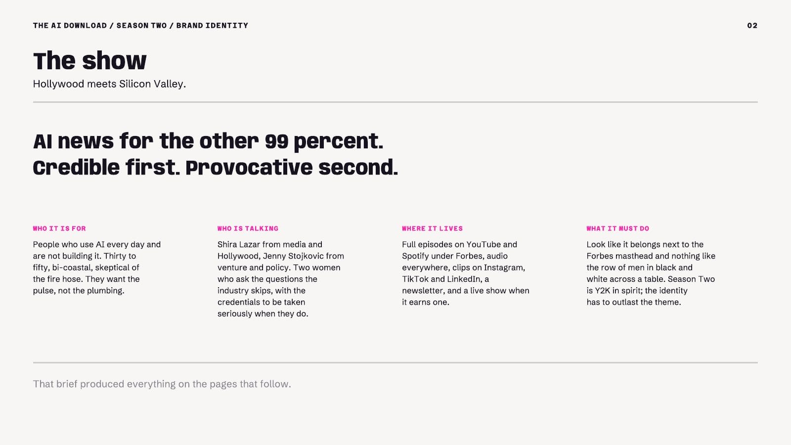
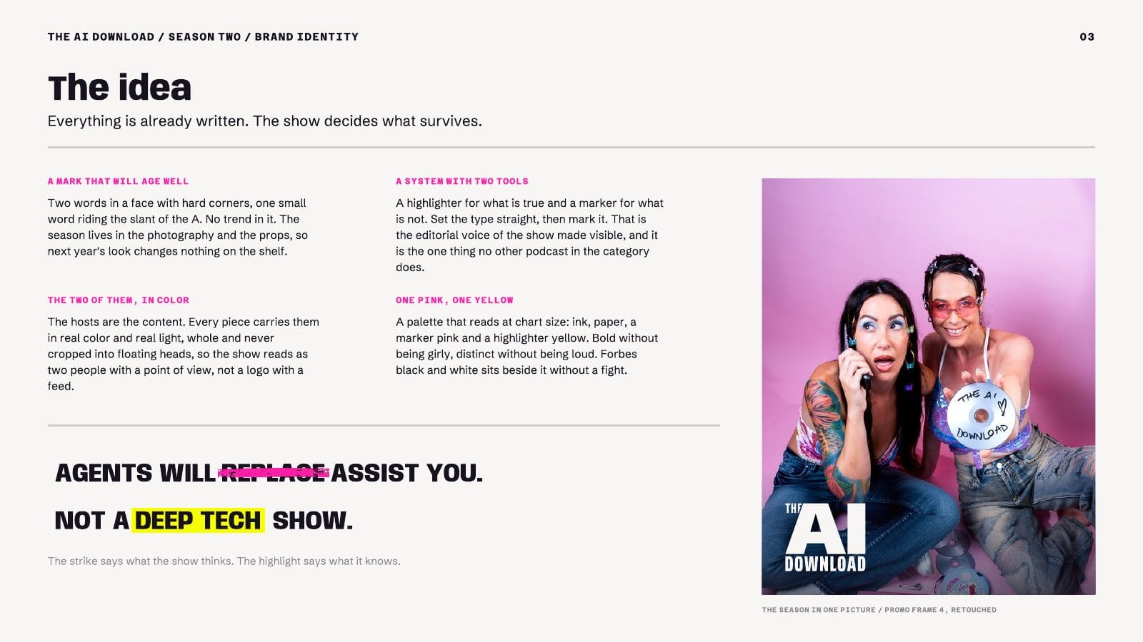
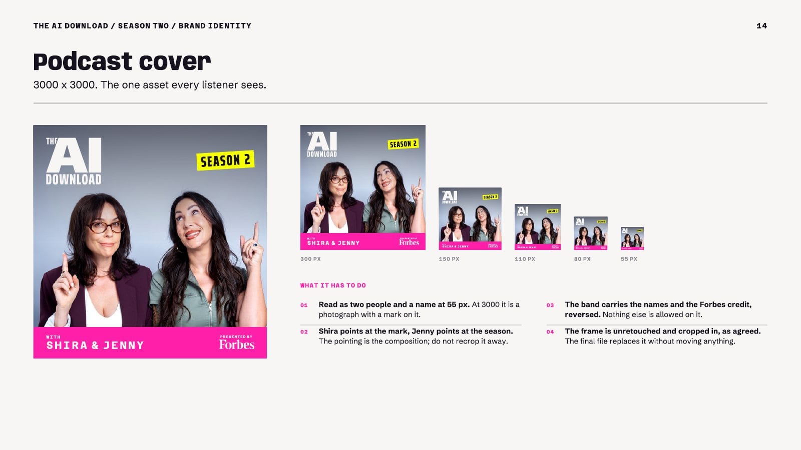
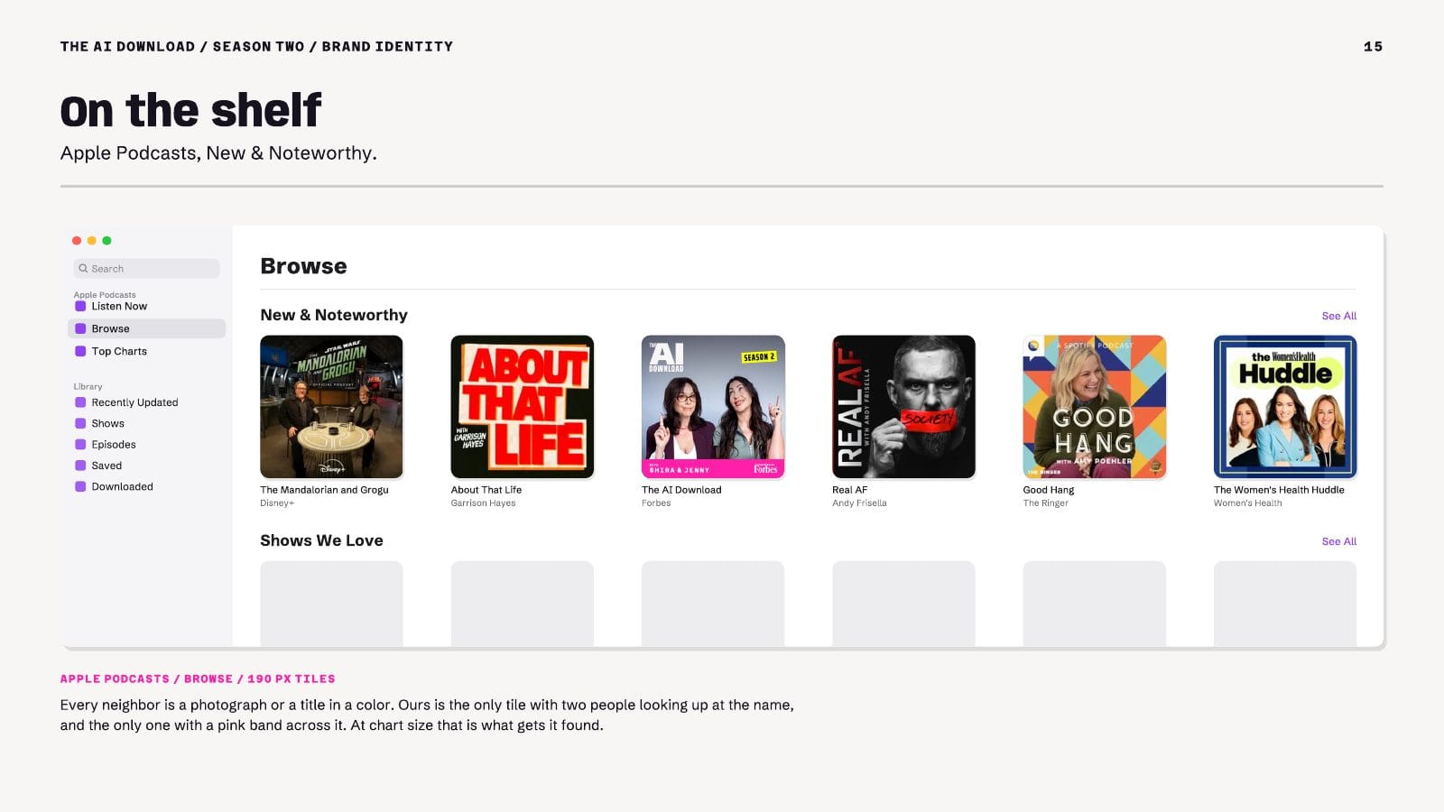
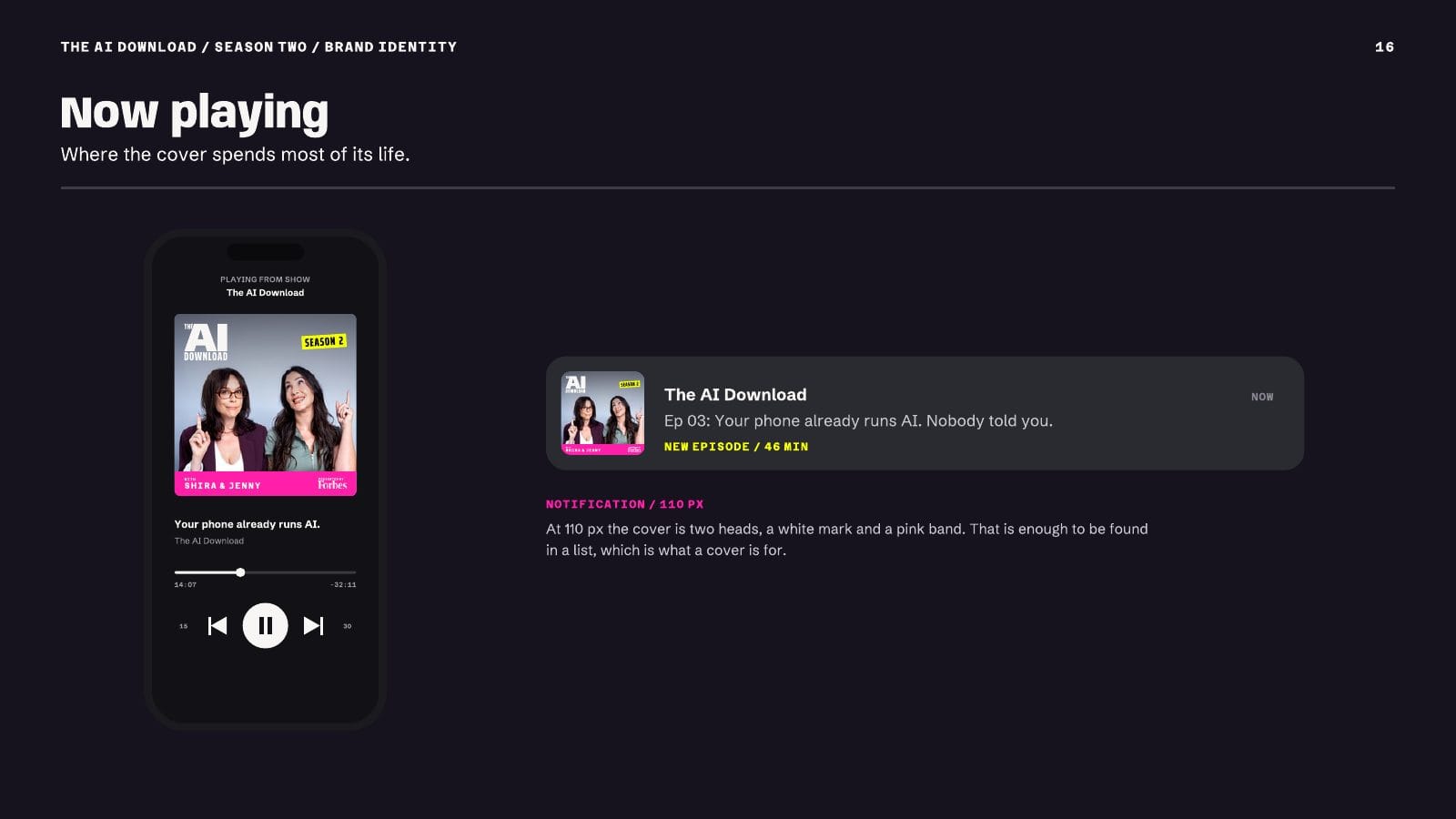
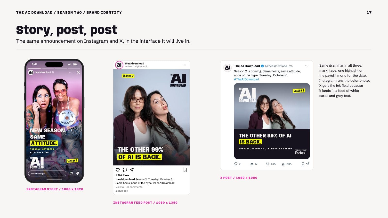
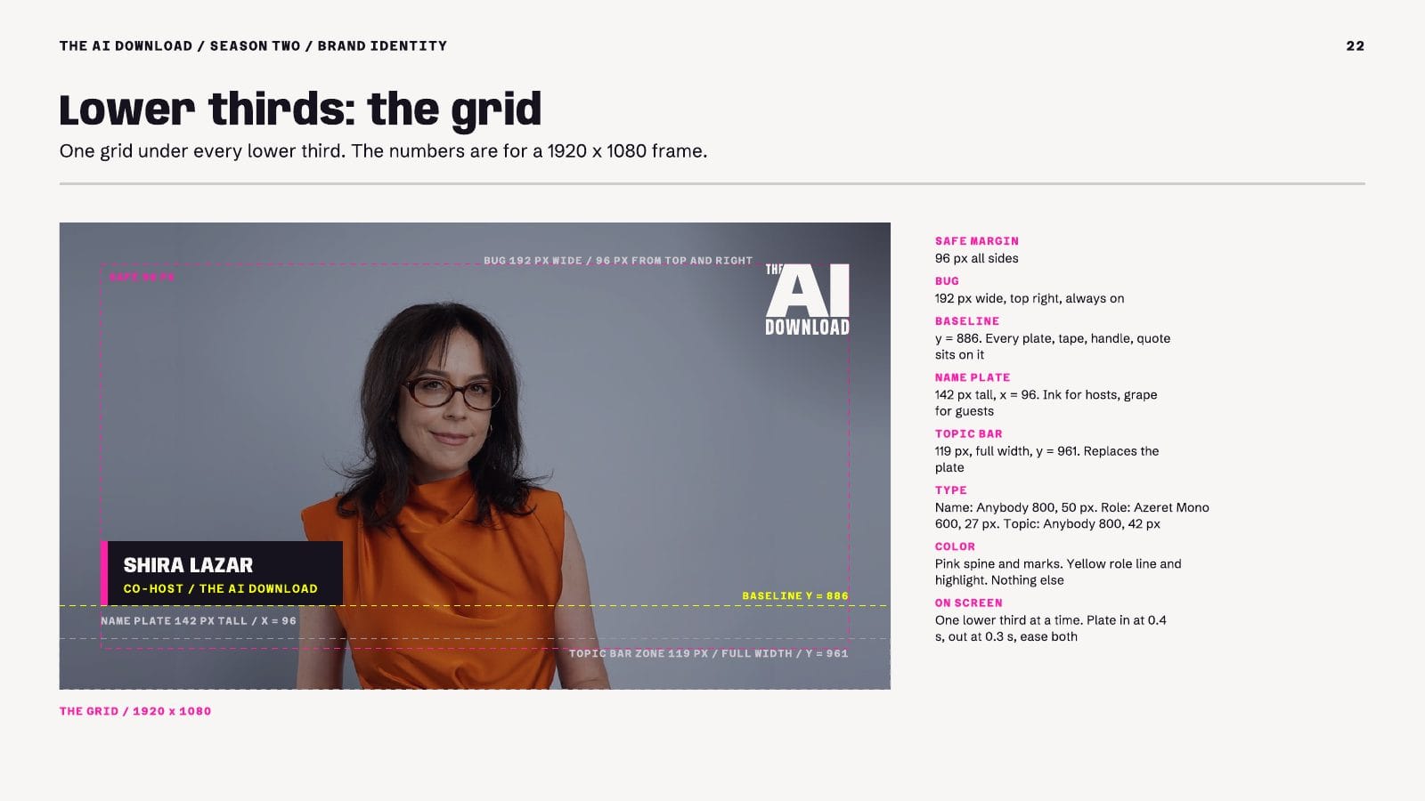
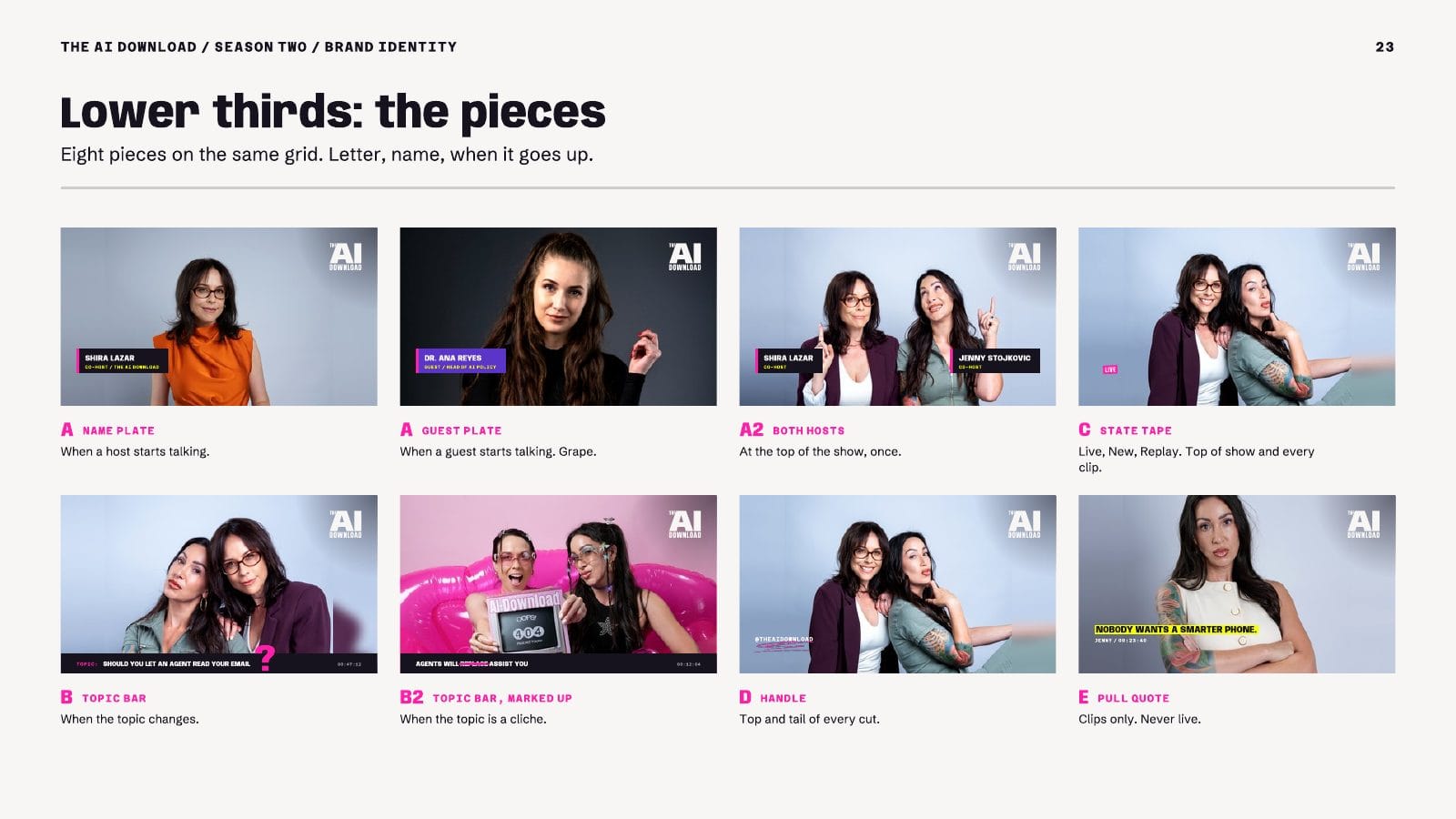
In September 2026 I built a brand identity system for Forbes: the Season Two identity for The AI Download, its podcast on consumer AI, hosted by Shira Lazar and Jenny Stojkovic. A large team works on the show, and most of the people on it never talk to a designer. The system had to let every one of them ship work that looks and sounds like one show.
The book does this with rules, not mood boards:
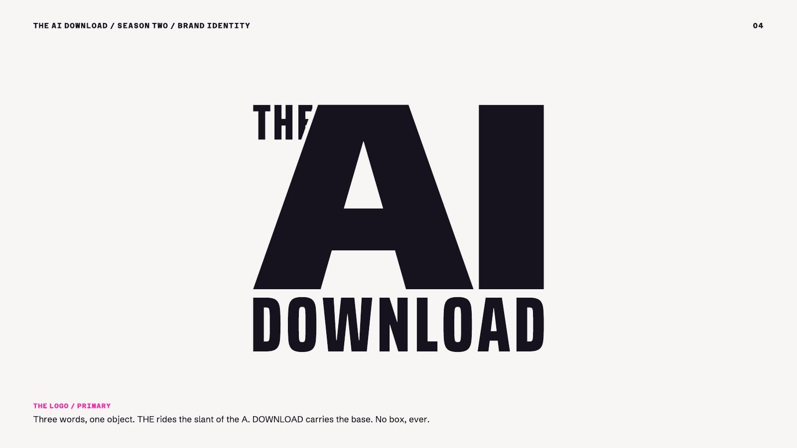
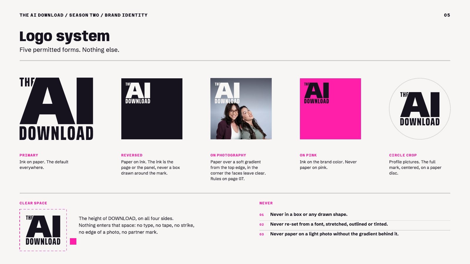
- Logo: five permitted forms and nothing else. Clear space is the height of the word DOWNLOAD on all four sides.
- Color: six colors with fixed jobs and a target mix for a typical piece: 58% paper, 26% ink, 8% pink, 6% yellow and 2% grape. A piece that is more than a tenth pink gets pulled back before it ships.
- Voice, made visible: a yellow highlighter marks what is true. A pink strike corrects a cliché in public. A sentence gets one or the other, never both.
- Video: one lower-third grid for a 1920 x 1080 frame, with exact positions, type sizes and timings, so an editor never has to guess.
The second half of the book applies every rule where the asset will live: the cover at 55 pixels, Apple Podcasts, a phone player, Instagram, X, YouTube, LinkedIn, a newsletter and an event poster. Click any page below to open it full size, then swipe through all 24.

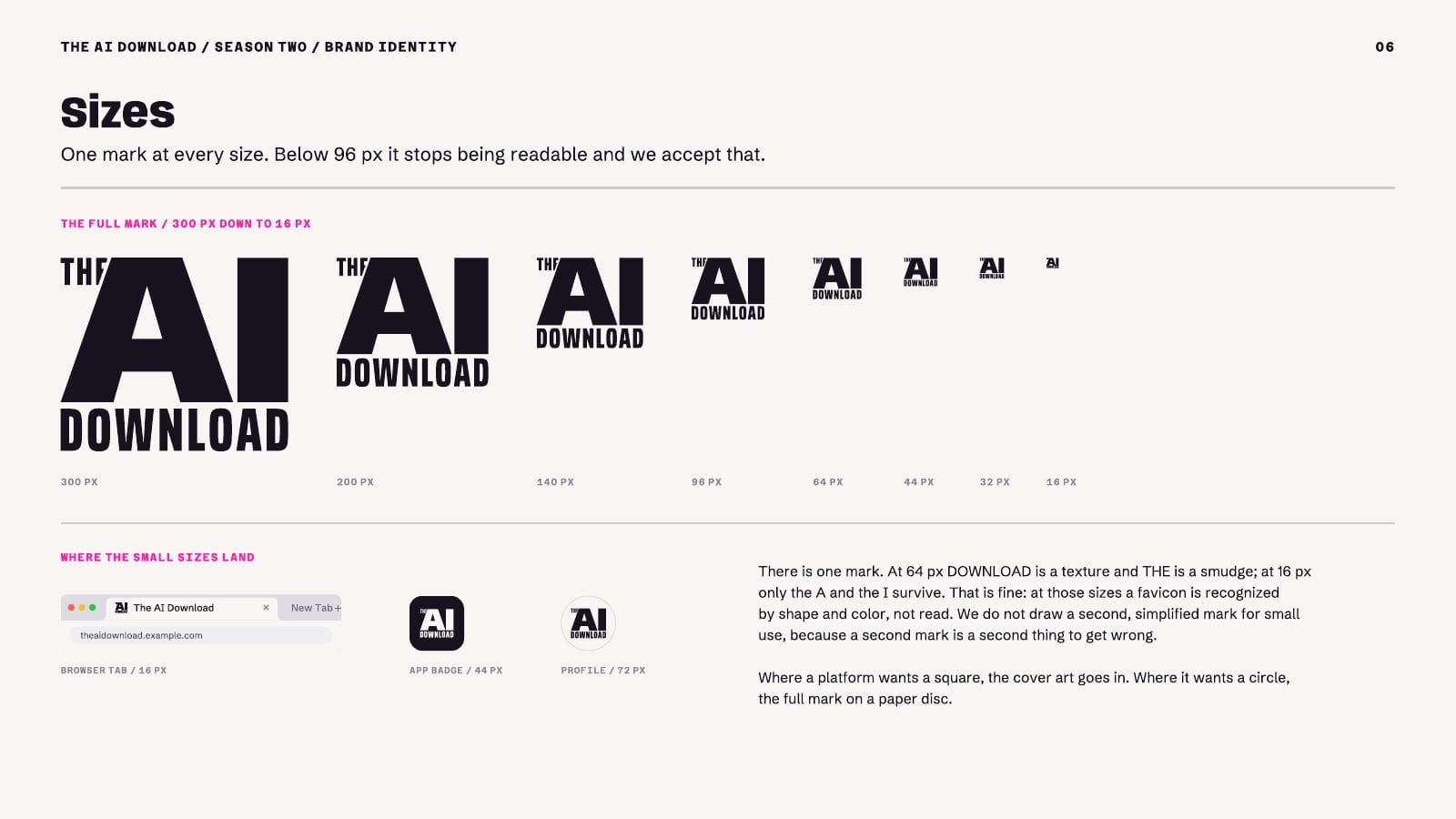
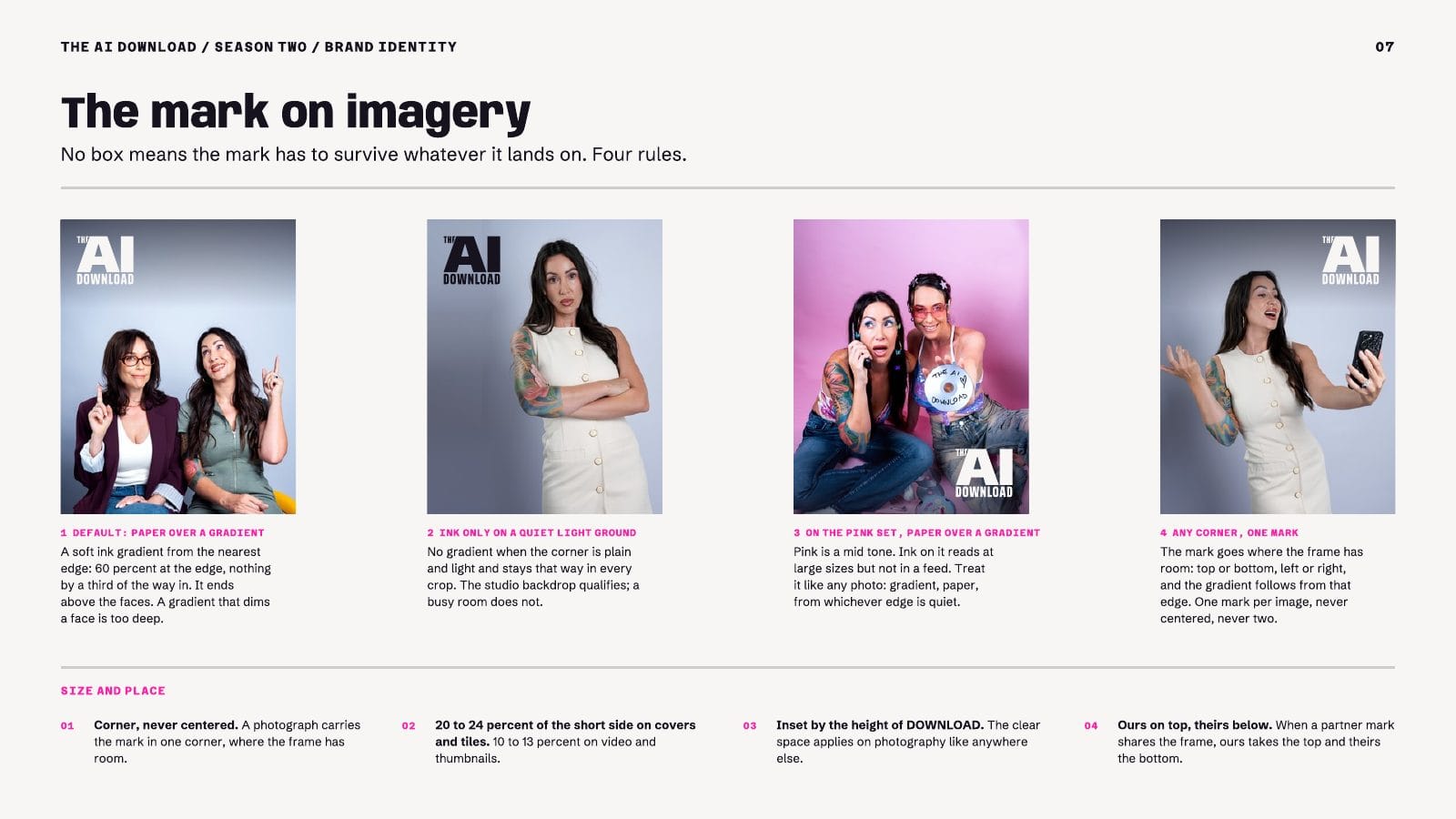
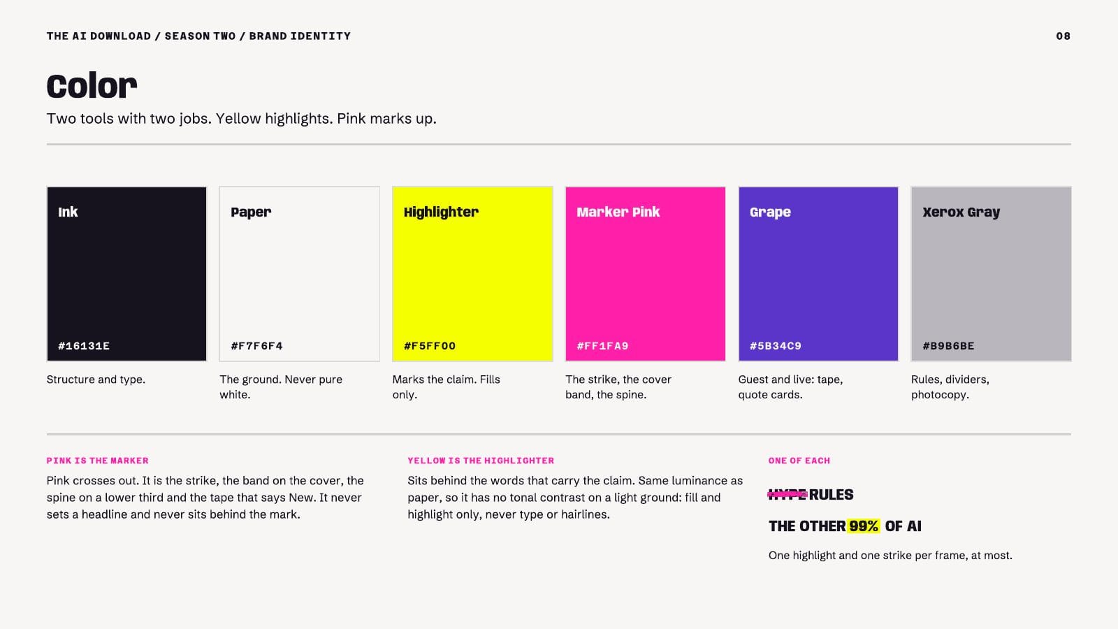
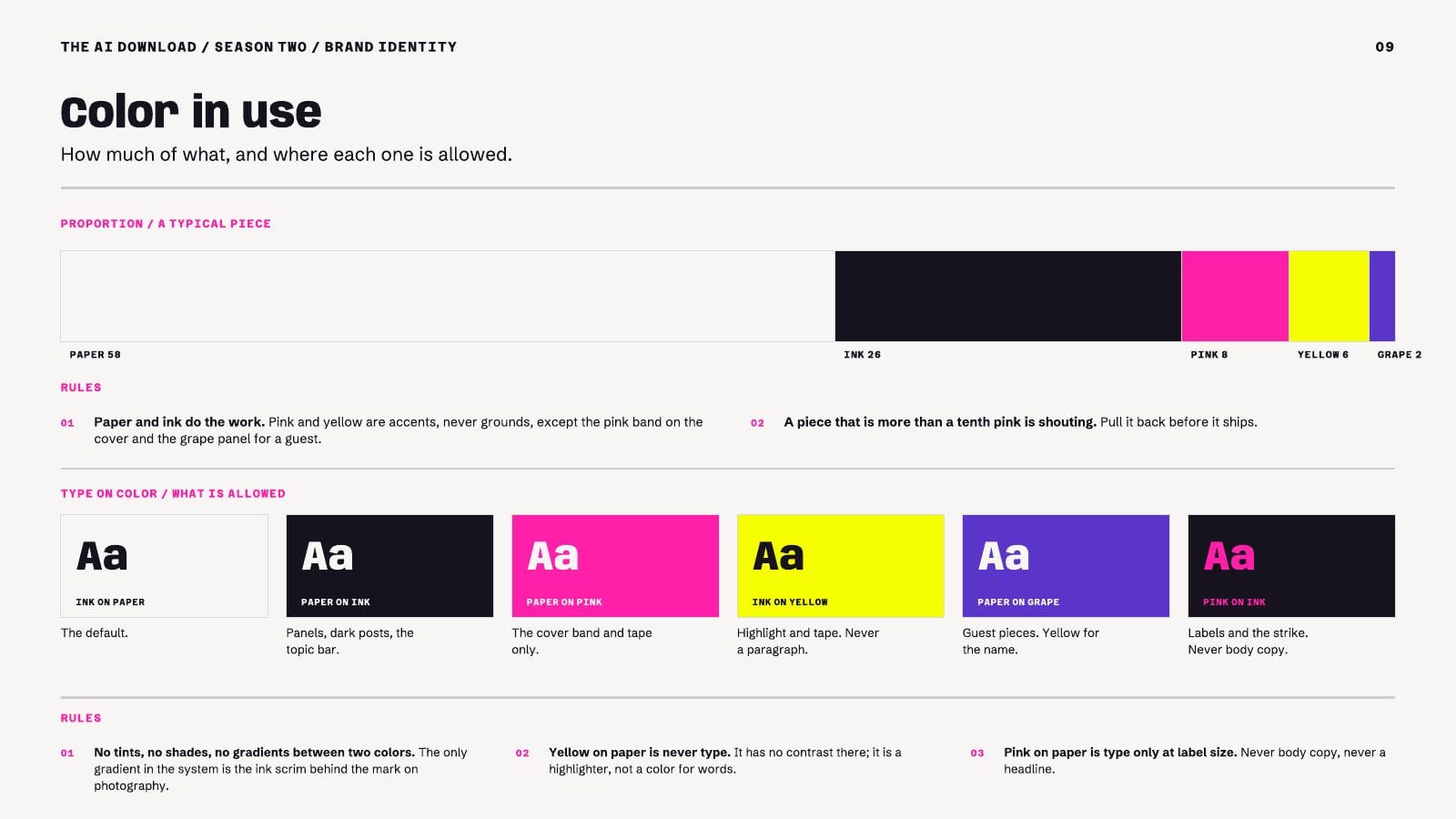
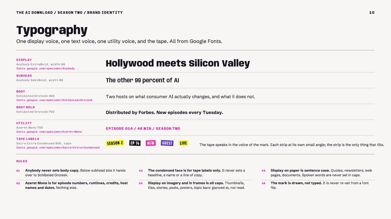
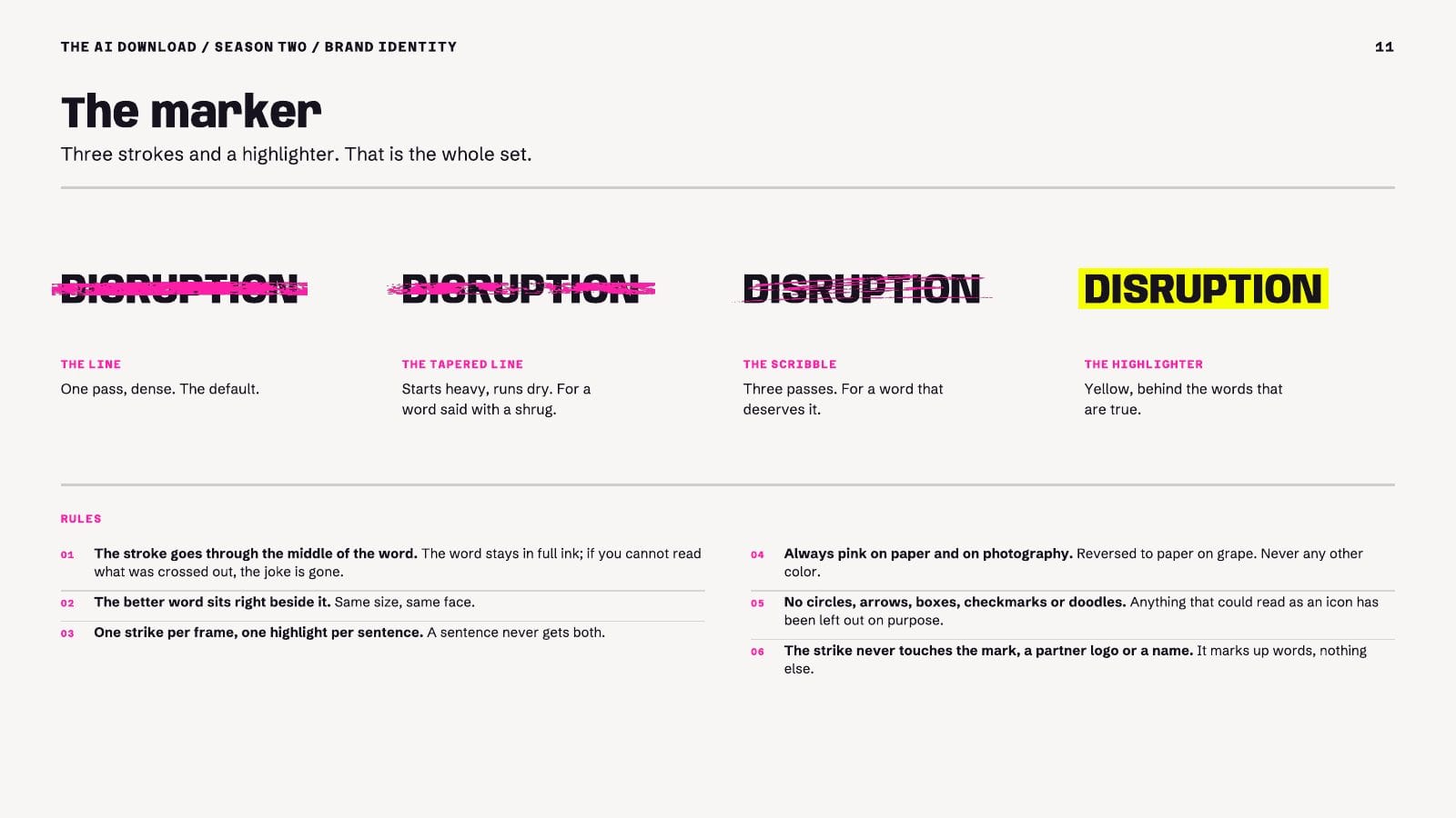
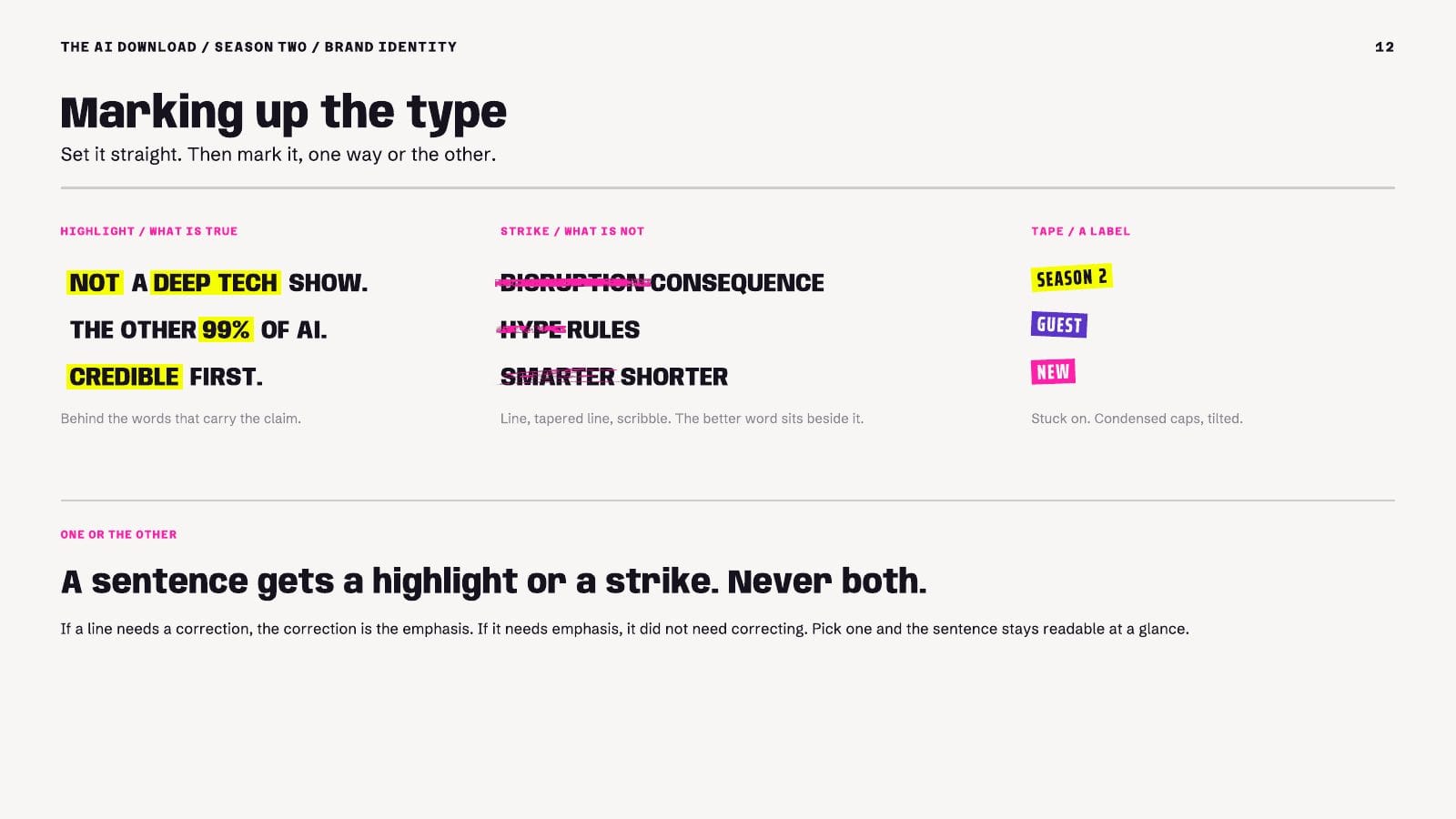
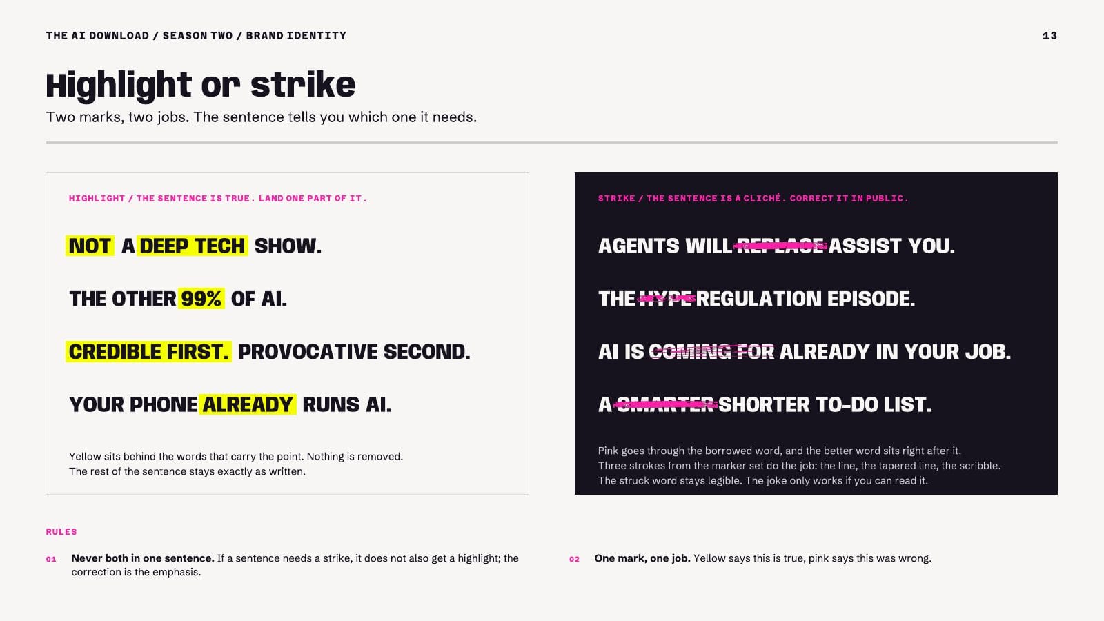
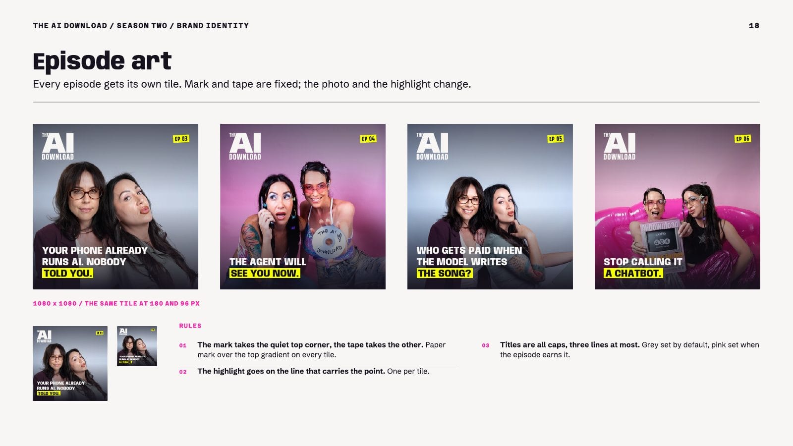
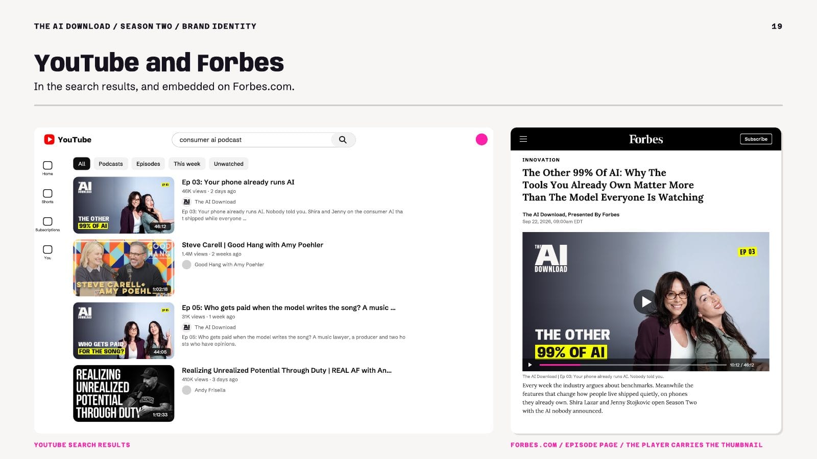
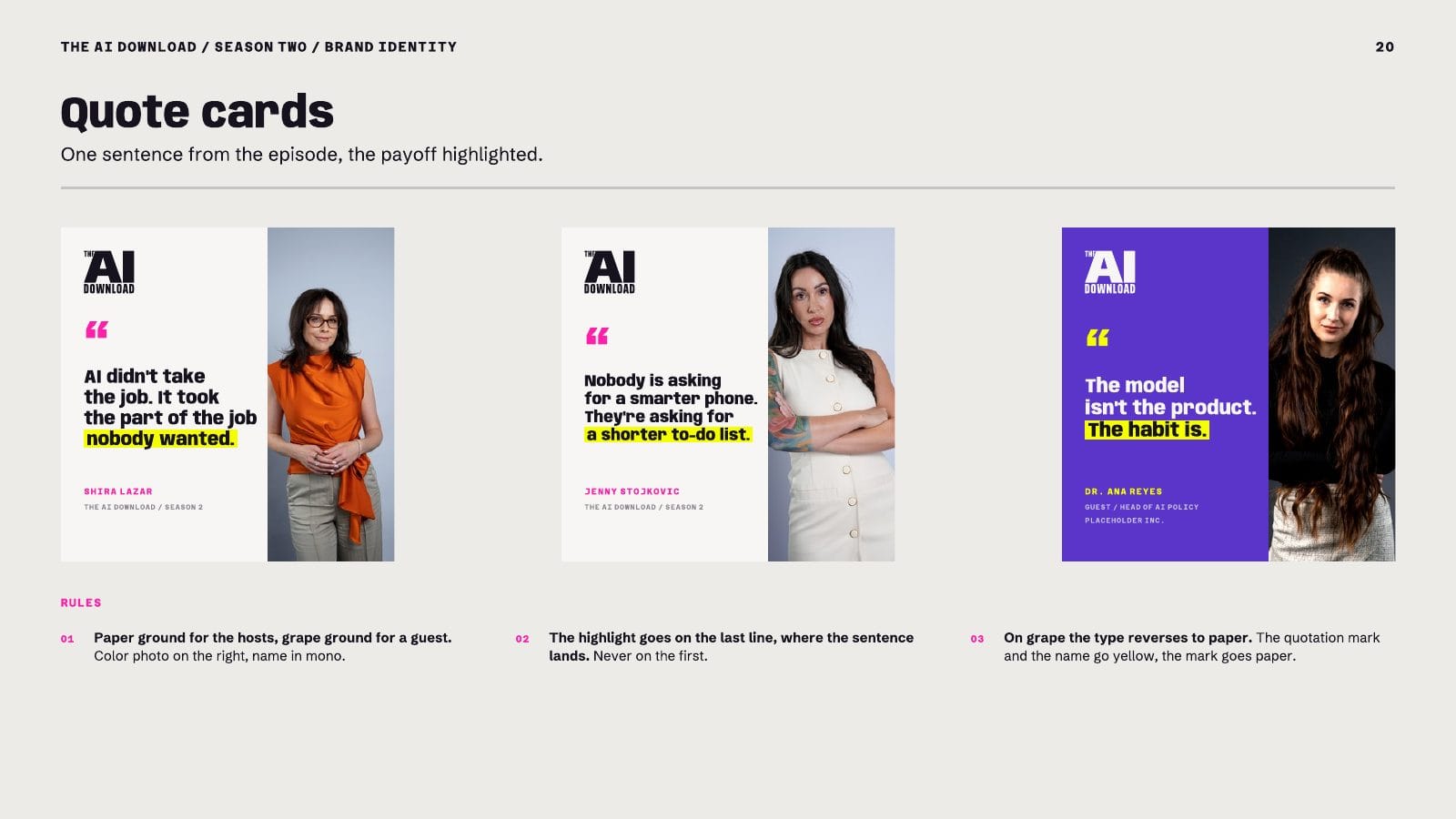
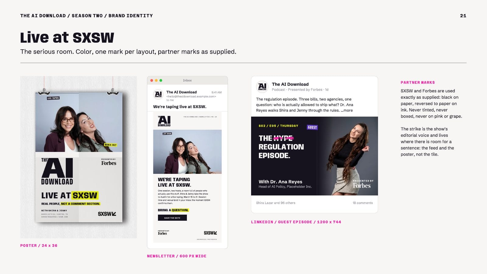
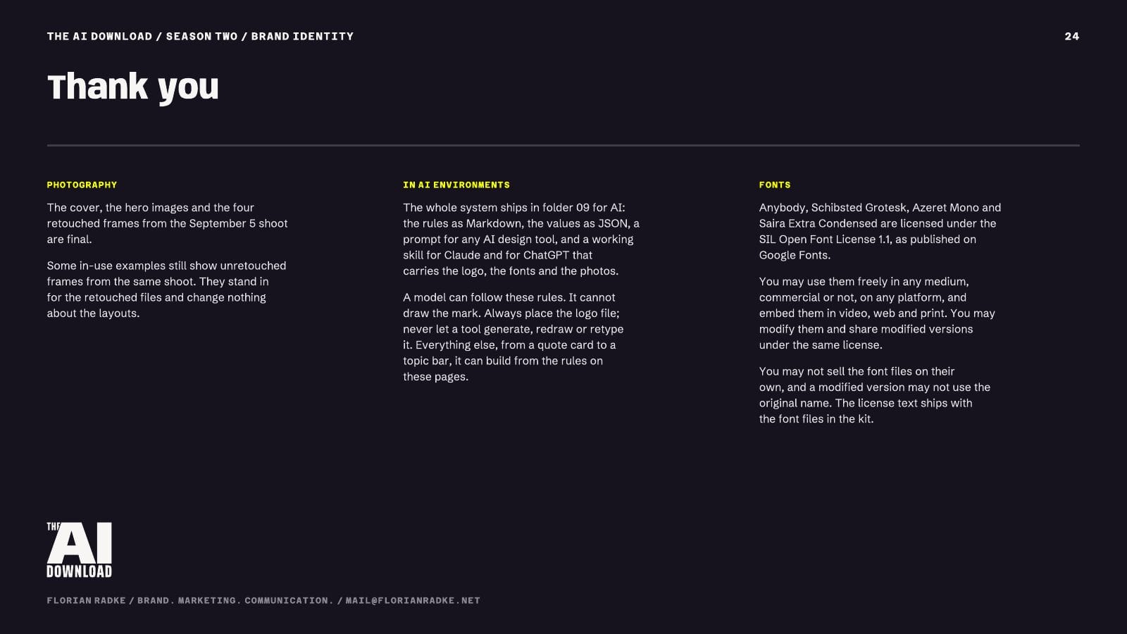
The identity also ships as a working AI skill for Claude and ChatGPT. It carries the rules, the color and type values, the logo files, the fonts and the photos, so anyone on the team can build a quote card or a topic bar that follows the book. The book also states the limit: a model can follow these rules, but it cannot draw the mark. The logo file is always placed, never generated or retyped. Rules explicit enough for a model to follow are explicit enough for a freelancer.
Minimum Viable Systems: When a Lighter Setup Is Enough
Not every organization requires a comprehensive 100-page operational system. Early-stage startups and lean teams often over-engineer their brand assets too early, spending critical capital on elaborate brand books before finding product-market fit.
At the early stage, the brand identity system exists to buy time. It needs to keep you looking professional in front of investors, early customers, and potential hires while you figure out the harder questions of positioning and market fit. A 100-page system does not buy more time; it burns it.
A minimum viable brand identity system requires only four functional pieces:
- A Single Primary Mark and Secondary Icon: Optimized for legibility at both 16 pixels (favicon/app icon) and large-format scales. Most early-stage companies need one lockup that works horizontally, one icon that works in a square, and nothing else.
- A 3-Color Functional Palette: One dominant brand color, one high-contrast surface color, and one dedicated accent/interaction color. This constraint forces cohesion by removing the option to choose.
- A Single Typeface Family: One versatile typographic family (with regular, medium, and bold weights) that handles both display titles and dense body text across digital and print applications. A single family with three weights outperforms three families with one weight each in production.
- A One-Page Operational Cheat Sheet: A single document listing explicit spatial ratios, margin rules, contrast minimums, and core messaging dos and don'ts. One page is enough because there is nothing else to document yet.
This lighter setup remains sufficient until a company expands its marketing beyond a single central team. The trigger points for expanding into a full operational system include: hiring outside creative agencies, onboarding a distributed regional sales force, launching distinct multi-product sub-brands, or scaling programmatic ad production.
Each trigger forces the same shift: work stops flowing through one pair of hands, and a system becomes cheaper than constant supervision. If you miss the trigger, the cost shows up in the form of a senior designer spending every week correcting off-brand assets instead of building anything new. That, more than any visual inconsistency, is the clearest sign you have outgrown the minimum.
Frequently Asked Questions
What is the difference between a brand identity system and a design system?
A brand identity system defines the total visual, verbal, and sensory presence of an organization across all possible touchpoints, including advertising, environmental signage, sales collateral, physical packaging, and customer communications. A design system is a specialized subset of that identity, focusing specifically on functional UI components, code repositories, interaction states, and digital product user experiences.
How does a well-crafted visual identity drive premium pricing?
A disciplined visual identity creates cognitive fluency, which is the ease with which a buyer's brain processes information. When a brand presents coherent, premium visual signals consistently, it reduces perceived purchase risk and signals established category leadership. B2B buyers routinely pay a premium for recognizable vendors to minimize professional and operational risk.
What are the core essentials for an early-stage startup?
An early-stage startup should focus on a primary logomark, a secondary square mark, a focused 3-color palette, a single versatile type family, and a one-page rule sheet. This foundation provides immediate professional cohesion across pitch decks and initial product interfaces without draining early capital.
Next Steps for Your Brand
To evaluate your brand identity system, run an honest audit of your existing assets using these practical steps:
- Collect your last ten customer-facing assets across marketing, sales, product, and customer success, placing them side by side on a single board.
- Remove all logos and company names to determine whether the visual language alone remains distinctive and unmistakably yours.
- Identify where non-designers are improvising, noting every instance of unauthorized colors, custom fonts, or broken layouts.
- Translate your static guidelines into native production templates within the tools your distributed teams and agencies use every day.
Subscribe to The Brand Algorithm for more on how brands are built, run and defended.